Introduction
We can present Big data & Analytics using visualization tools. Python is a great programming language with variety of options. It is object oriented, semantically structured & great for scripting programs. Python is a favorite tool for programmers and data scientists. This is because of the following.
- Easy to learn.
- The extensive list of built-in features.
- Importable libraries contribute to increased productivity.
The Python language has been around for nearly 30 years. It has numerous users contributed libraries. It has many use cases. Following are some of the use case. They are,
- Image modification.
- Data analysis.
- Server automation.
Data visualization is the discipline of trying to understand data. This is possible by placing it in a visual context. We can detect and expose the patterns, trends as well as correlations.
Data Visualization is the presentation of data. This will be in graphical format. It will help the people to understand the significance of data. This is possible by summarizing and presenting huge amount of data.
Python offers multiple great graphic libraries. This will come packed with lots of different features. Python has an excellent library to create interactive Plot. We can also create live or highly customized plots using python.
Following are a few popular plotting libraries. They are,
- Matplotlib: low level, provides lots of freedom.
- Pandas Visualization: easy to use interface, built on Matplotlib.
- Seaborn: high-level interface, great default styles.
- ggplot: based on R’s ggplot2, uses Grammar of Graphics.
- Plotly: can create interactive plots.
Matplotlib
Matplotlib is the most popular python plotting library. It is a low-level library with a Matlab like interface. It offers lots of freedom at the cost of having to write more code.
To install Matplotlib, we can use pip and conda.
| pip install matplotlib
or conda install matplotlib |
Matplotlib is specifically good for creating basic graphs. Some of the basic graphs are as follows.
- Line charts.
- Bar charts.
- Histograms and many more.
We can import by typing:
| import matplotlib.pyplot as plt |
Pandas
Pandas is an open source. It is high-performance, easy-to-use library providing data structures. It provides data-frames, and data analysis tools.
For example:
Visualization tools is one of the best data analysis tools.
Pandas Visualization makes it easy to create plots. This will be out of a Pandas data-frame and series. It also has a higher-level API than Matplotlib. It means we need less code for the same results.
To install Pandas, we can use pip or conda.
| pip install pandas
or conda install pandas |
Seaborn
It is a data visualization library based on Matplotlib. It provides a high-level interface for creating attractive graphs.
Seaborn has a lot to offer. We can create graphs in one line. This will take you multiple tens of lines in Matplotlib. Its standard designs are awesome. It also has a nice interface for working with Pandas data-frames.
We can import Seaborn by typing:
| import seaborn as sns |
ggplot
ggplot is a system for declarative. This will create graphics based on the grammar. We must provide the data as well as tell the following.
- How to map variables to aesthetics.
- What graphical primitives to use?
Finally, it will take care of the details for display.
To install this, we must write:
| # The easiest way to get ggplot2 is to install the whole tidyverse:
install.packages(“tidyverse”) # Alternatively, install just ggplot2: install.packages(“ggplot2”) # Or the the development version from GitHub: # install.packages(“devtools”) devtools::install_github(“tidyverse/ggplot2”) |
Plotly
Fifth tool is Plotly. It is also named as Plot.ly because of its main platform online. It is an interactive online visualization tool. It contains a great API including one for Python. There are lot of interactive & professional quality visualizations. We can create this with the module.
It is different from other Python’s libraries. It is an interactive online tool for creating the renderings. Therefore, everything we create with this tool can posted on the web. The great thing about Plotly is that it integrates well with pandas.
The simplest way to use it is through Plotly’s online tools. We can import the data by uploading the data set file. It has many convenient features. They are,
- To interact with.
- Extract.
- Visualize the data.
Additionally, the tool accepts many formats, such as .xls, .xlsx, or .csv files.
Visualization Method – a short view
We have listed various visualization methods. The most common technique we prefer is Pandas. It is the simplest method for basic plots. While Seaborn is great for creating visually appealing statistical charts. This will include colors. Bokeh works great for more complicated display. It is ideal for web based interactive display. Pygal works well for generating vector. It will be interactive files. However, it is not flexible as other methods. Plotly is the most useful and easiest option. This is for creating web based highly interactive display.
Charts
Here we are going to see five important charts. They are,
- Histogram.
- Column Chart.
- Box plot chart.
- Pie Chart.
- Scatter plot.
We are going to consider the following data sets. Using these data sets we are going to represent these graphs.
| S: No | EMP ID | GENDER | AGE | SALES | BMI | INCOME |
| 0 | E001 | M | 34 | 123 | Normal | 350 |
| 1 | E002 | F | 40 | 114 | Overweight | 450 |
| 2 | E003 | F | 37 | 135 | Obesity | 169 |
| 3 | E004 | M | 30 | 139 | Underweight | 189 |
| 4 | E005 | F | 44 | 117 | Underweight | 183 |
| 5 | E006 | M | 36 | 121 | Normal | 80 |
| 6 | E007 | M | 32 | 133 | Obesity | 166 |
| 7 | E008 | F | 26 | 140 | Normal | 120 |
| 8 | E009 | M | 32 | 133 | Normal | 75 |
| 9 | E010 | m | 36 | 133 | Underweight | 40 |
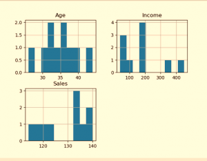
Histogram
It represents the frequency of occurrence of specific phenomena. This will lie within a specific range of values. It will arrange in consecutive as well as fixed intervals.
This histogram plot is for Age, Income and Sales. The output plot shows the frequency of each value for each attribute.
| # import pandas and matplotlib import pandas as pd
import matplotlib.pyplot as plt # create 2D array of table given above data = [[‘E001’, ‘M’, 34, 123, ‘Normal’, 350], [‘E002’, ‘F’, 40, 114, ‘Overweight’, 450], [‘E003’, ‘F’, 37, 135, ‘Obesity’, 169], [‘E004’, ‘M’, 30, 139, ‘Underweight’, 189], [‘E005’, ‘F’, 44, 117, ‘Underweight’, 183], [‘E006’, ‘M’, 36, 121, ‘Normal’, 80], [‘E007’, ‘M’, 32, 133, ‘Obesity’, 166], [‘E008’, ‘F’, 26, 140, ‘Normal’, 120], [‘E009’, ‘M’, 32, 133, ‘Normal’, 75], [‘E010’, ‘M’, 36, 133, ‘Underweight’, 40] ] # dataframe created with # the above data array df = pd.DataFrame(data, columns = [‘EMPID’, ‘Gender’, ‘Age’, ‘Sales’, ‘BMI’, ‘Income’] ) # create histogram for numeric data df.hist() # show plot plt.show() |
OUTPUT
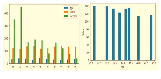
Column Chart
A column chart is used to show a comparison among different attributes. In other words, it can show a comparison of items over time.
| # Dataframe of previous code is used here
# Plot the bar chart for numeric values # a comparison will be shown between # all 3 age, income, sales df.plot.bar() # plot between 2 attributes plt.bar(df[‘Age’], df[‘Sales’]) plt.xlabel(“Age”) plt.ylabel(“Sales”) plt.show() |
OUTPUT
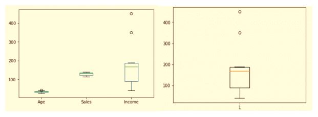
Box plot chart
A box plot is a graphical representation of statistical data. It based on the following. They are,
- Minimum.
- First quartile.
- Median.
- Third quartile.
- Maximum.
The term “box plot” comes from the fact that the graph looks like a rectangle. It will be with lines extending from the top and bottom. Because of the extending lines, this type of graph is box-and-whisker plot.
| # For each numeric attribute of dataframe df.plot.box()
# individual attribute box plot plt.boxplot(df[‘Income’]) plt.show() |
OUTPUT
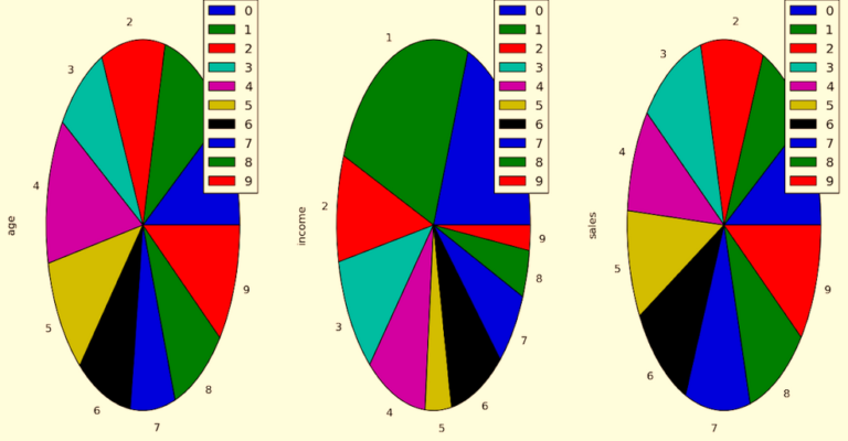
Pie Chart
A pie chart shows a static number. It also shows the categories represent. It will represent as a part of a whole the composition of something. A pie chart represents numbers in percentages. The total sum of all segments needs to equal 100%.
| plt.pie(df[‘Age’], labels = {“A”, “B”, “C”, “D”, “E”, “F”, “G”, “H”, “I”, “J”},
autopct =’% 1.1f %%’, shadow = True) plt.show() plt.pie(df[‘Income’], labels = {“A”, “B”, “C”, “D”, “E”, “F”, “G”, “H”, “I”, “J”}, autopct =’% 1.1f %%’, shadow = True) plt.show() plt.pie(df[‘Sales’], labels = {“A”, “B”, “C”, “D”, “E”, “F”, “G”, “H”, “I”, “J”}, autopct =’% 1.1f %%’, shadow = True) plt.show() |
OUTPUT
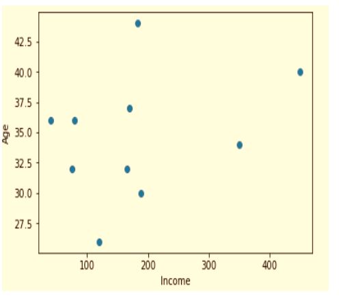
Scatter plot
A scatter chart shows the relationship between two different variables. It can reveal the distribution trends. We should use this when there are different data points. We should also use this to highlight similarities in the data set. This is useful when looking for outliers. This is very helpful in understanding the distribution of our data.
| # scatter plot between income and age plt.scatter(df[‘income’], df[‘age’])
plt.show() # scatter plot between income and sales plt.scatter(df[‘income’], df[‘sales’]) plt.show() # scatter plot between sales and age plt.scatter(df[‘sales’], df[‘age’]) plt.show() |
OUTPUT:
Conclusion
Big Data without proper visualization is difficult to analyze. Python is one of the most innovative and popular tools. The good news that it does not take much to create visualization in Python. Since this language is there for 30 years and accrue exclusive libraries.
There are multiple tools and options to visualize the data. However, having variety of options complicates the matter. It may create confusion for users. Identify proper method that we should use. This will depend on a project requirements and expectations. The proper way is to test different techniques. We should also understand which one is appropriate.
Here we have a short discussion about various methods. This will also show which one is useful. However, it will depend on the need of the project and its requirement.
To Get Data Science or Python Related Training
Data Science Training in Chennai
PRIVATE 3100Python Training in Chennai
PRIVATE 2884

