Introduction to Tableau
Tableau Software is a software company. Its headquarters is in Seattle, Washington. It produces interactive data visualization products. This will focus on business intelligence. Stanford University’s Department of CS established Tableau between 1997 & 2002.
Tableau is a data analytics as well as a visualization tool. Today we use this in the industry. Many businesses consider it as the basis for data science-related work. Tableau is easy to use. It comes from the fact that it has a drag as well as drop interface. This feature helps to perform the following tasks. They are,
- Sorting.
- Comparing.
- Analyzing.
We can do this task very easily and fast. Tableau is also compatible. This is possible with the following. They are,
- Multiple sources.
- Including Excel.
- SQL Server.
- Cloud-based data.
These will make it an excellent choice for Data Scientists.
The main products offered by tableau are in the following diagram.
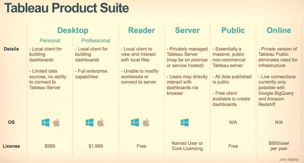
Following will offer Data Visual Creation. The choice will depend upon the type of work. They are,
- Tableau Desktop.
- Tableau Public.
- Tableau Online.
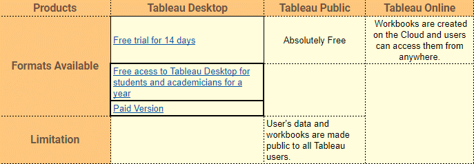
In this article, we will see in detail with Tableau Desktop.
Installation
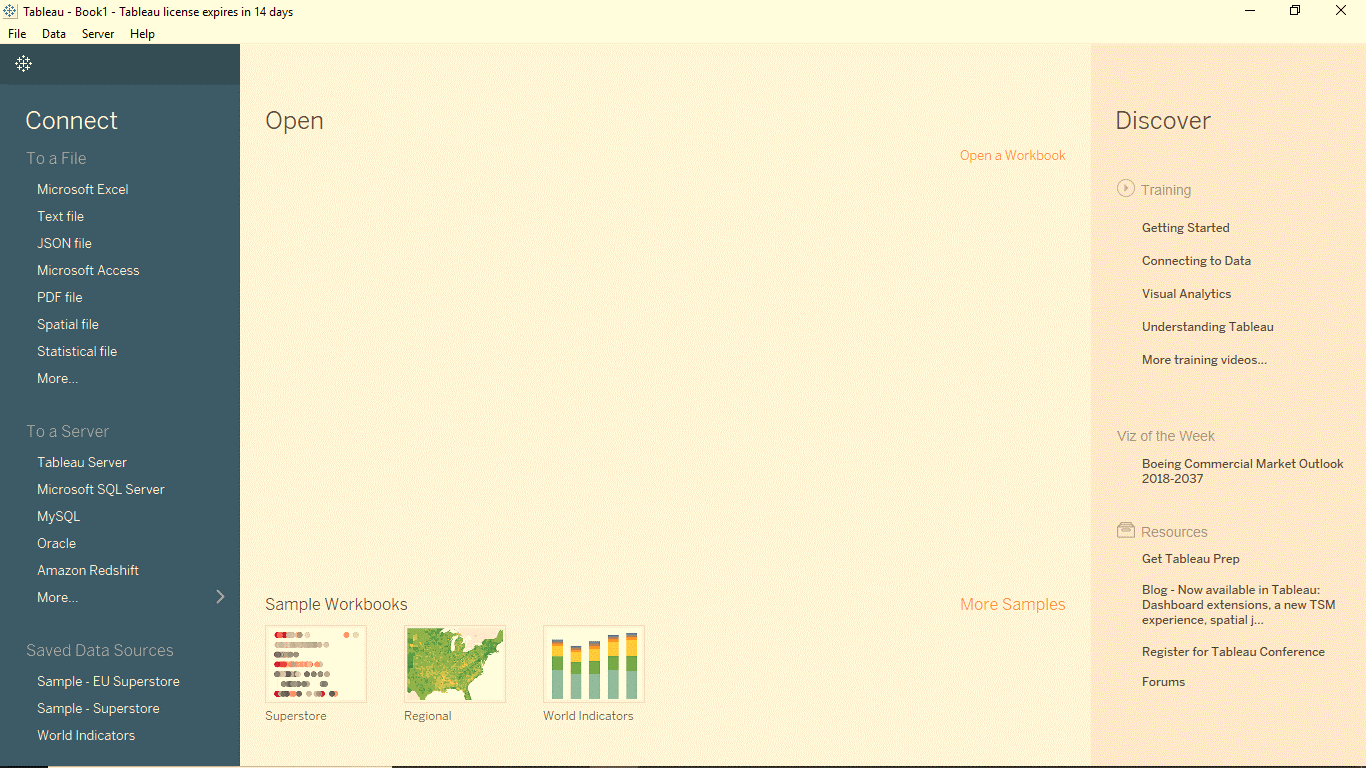
Download the software on to the computer. It will depend upon the choice of product. First, we must accept the license agreement. After that, we can verify the installation. This is possible by clicking the Tableau Icon. If the following screen appears, we are good to go.
Getting Started
In this section, we will learn some basic operations in Tableau. This is to get accustomed to its interface.
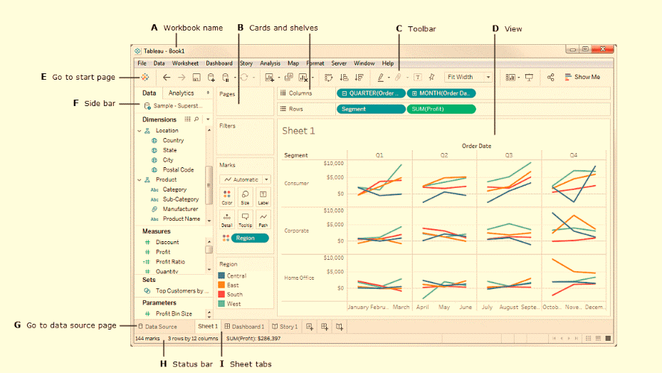
Tableau Workspace
The Tableau workspace is a collection of the following. They are,
- Worksheets.
- Menu bar.
- Toolbar.
- Marks card.
- Shelves and a lot of other elements.
Sheets can be worksheets, dashboards, or stories. The image below highlights the major components of the workspace. However, we can achieve more familiarity. This will achieve once we work with actual data.
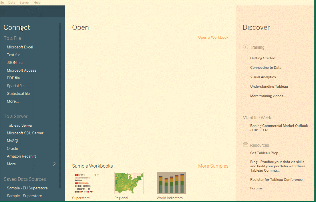
Connecting to a Data Source
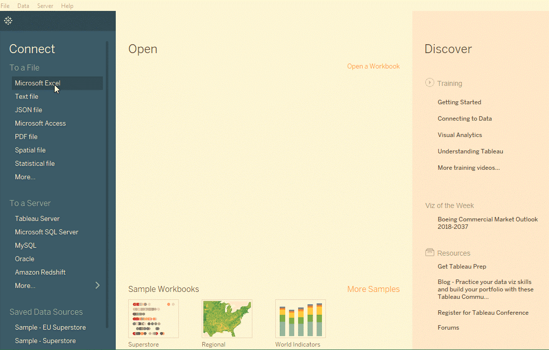
To begin working with Tableau, we need to connect Tableau to the data source. Tableau is compatible with a lot of data sources. The data sources supported by Tableau will appear on the left side of the opening screen. Some commonly used data sources are as follows. They are,
- Excel.
- Text file.
Relational database or even on a server. One can also connect to a cloud database source. Some of the common cloud database source are as follows. They are,
- Google Analytics.
- Amazon Redshift, etc.
The launch screen of Tableau Desktop shows the available data sources. It is also dependent on the version of Tableau. Since the paid version offers more possibilities. On the left side of the screen, there is a Connect pane. It will highlight the available sources. We should first list the File types. Followed by this we must list the common server types. We can also list the servers which we recently connect. We can open previously created workbooks Under Open tab. Tableau Desktop also provides some sample workbooks under Sample Workbooks.
Hands On
Connecting to the Sample-Superstore data set
We shall be working with a sample data set names Superstore data set. These data sets are simply pre-loaded with Tableau. However, we will be downloading the file from here. So, we can get an idea of connecting to an Excel data source. The data is that of a superstore. It contains information about products, sales, profits, etc. Our aim as Data Analysts is to analyze the data. We should also find critical areas of improvement. This improvement is within this fictitious company.
Steps
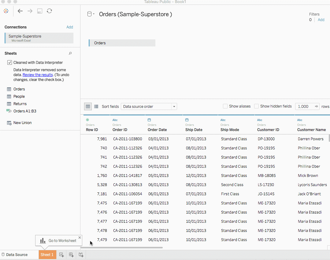
- Import the Data into tableau workspace from the computer.
- Under the Sheets Tab, three sheets will become visible. They are namely Orders, People, and Returns. However, we will focus only on the Orders data. Double click on Orders Sheet, and it opens just like a spreadsheet.
- We observe the first three rows of data. It looks a bit different and is not in the desired format. Here we make use of Data Interpreter, also present under Sheets Tab. By clicking on it, we get a nicely formatted sheet.
Hands On
Creating a View
We will start by generating a simple chart. In this, we will get to know our data. We will begin to ask questions about the data to gain insights. There are some important terms that we will encounter in this session. They are,
- Dimension
- Measures
- Aggregation
Dimensions are qualitative data, such as a name or date. By default, Tableau automatically classifies the data. The data will contain qualitative or categorical information as a dimension.
For example, take any field with text or date values. These fields generally appear as column headers for rows of data. This may be Customer Name or Order Date. This will also define the level of granularity that shows in the view.
Measures are quantitative numerical data. By default, Tableau treats any field containing this kind of data as a measure. For example, sales transactions or profit. The data which can be classified as a measure can be aggregated. For example, total sales (Measure) by region (Dimension).
Aggregation is the row-level data. This can roll up to a higher category. For example, the sum of sales or total profit.
Tableau automatically sorts the fields in Measures and Dimensions. However, for any anomaly, one can change it manually too.
Steps
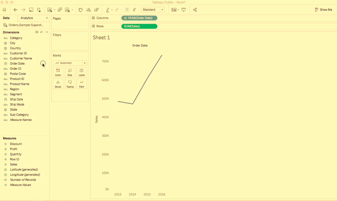
- Go to the worksheet. Click on the tab Sheet 1 at the bottom left of the tableau workspace.
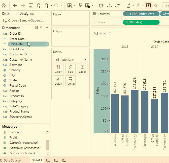
- Once, you are in the worksheet, from Dimensions under the Data pane. Drag the Order Date to the Column shelf.
- On dragging the Order Date to the columns shelf, it will create a column. This column is for each year of Orders in the data set. An ‘Abc’ indicator is visible under each column. This will imply that text or numerical or text data can drag here. On the other hand, if we pulled Sales here, it will create a cross-tab. This will show the total Sales for each year.
- Similarly, from the Measures tab, drag the Sales field onto the Rows shelf.
Tableau populates a chart with sales aggregated as a sum. It will display the total aggregated sales for each year by order of date. Tableau always populates a line chart for a view. It will include time-field which in this example is Order Date.
Refining the View
Let us delve deeper and try to find out more insights regarding which products drive more sales. Let’s start by adding the product categories to sales totals in a different way.
Steps
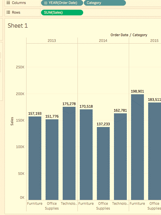
- The category is present under the Dimensions pane. Drag it to the columns shelf and place it next to year. The Category should be placed to the right of Year. In this, the view immediately changes to a bar chart type from a line. The chart shows the overall Sales for every Product by year.
Learn More
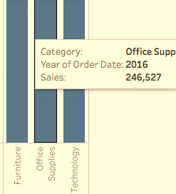
To view information about each data point, one of the bars to reveal a tooltip. The tooltip displays total sales for that category. Here is the tooltip for the Office Supplies category for 2016.
To add labels to the view, click Show Mark Labels on the toolbar.
We can display the bar chart horizontally instead of vertically. Click Swap on the toolbar for the same.
- The view above nicely shows sales by category, i.e., furniture, office supplies, and technology. We can also infer the furniture sales. They are growing faster than sales of office supplies except for 2016. Hence, it will be wise to focus sales efforts on furniture instead of office supplies. But furniture is a vast category. It consists of many different items. How can we identify? Which furniture item is contributing to maximum sales?
To help us answer that question, we will look at products by Sub-category. This is to see which items are the big sellers. Let’s say for the Furniture category. We want to look at details about only the following. They are,
- Bookcases.
- Chairs.
- Furnishing.
- Tables.
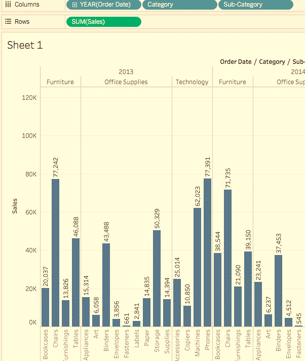
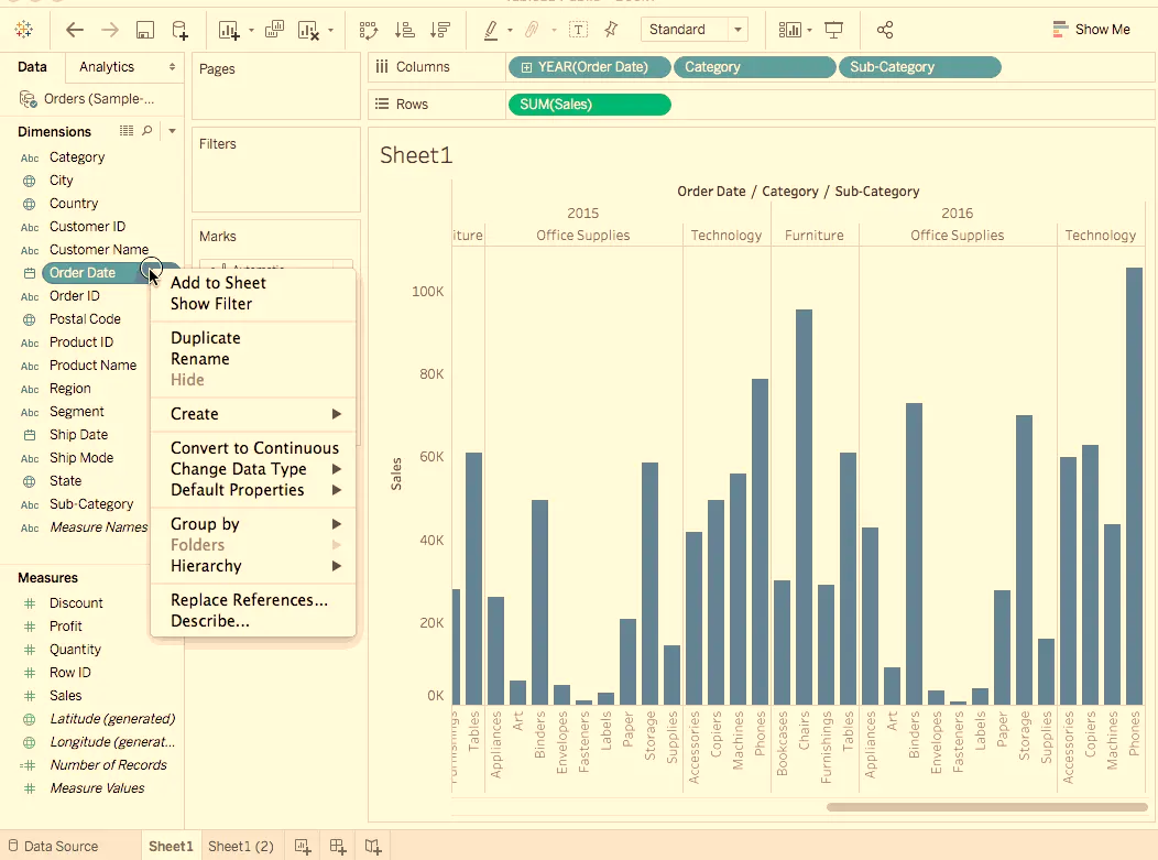
We will Double-click or drag Sub-Category dimension to Columns shelf.
The sub-category is another discrete field. The Category & displays a bar for every sub-category broken down. This will be by category & year in further. It is a humongous amount of data to make sense of visually.
Hands On
Emphasizing the Results
In this section, we will try to focus on specific results. Filters & colors are ways to add more focus to the details that interest us.
Adding filters to the view
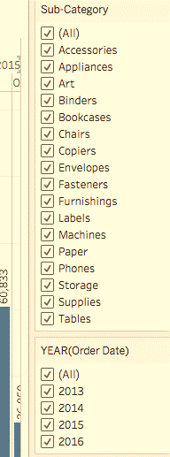
Filters can be used to include or exclude values in the view. Here we try to add two simple filters to the worksheet. This will make it easier to look at product sales by sub-category. This is for a specific year.
Steps
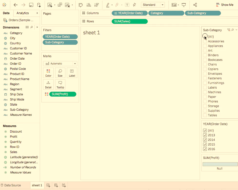
In the Data pane, under Dimensions, right-click Order Date & select Show Filter. Repeat for Sub->category field also.
Adding colors to the view
Colors can be helpful in the visual identification of a pattern.
Steps
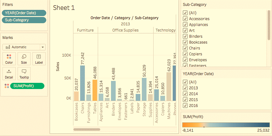
In the Data pane, under Measures, drag Profit to Color on the Marks card.
We can see the bookcases, Tables & machine contribute to negative profit. We can say this as a loss. A powerful insight.
Hands On
Key Findings
Let’s take a closer look at the filters. This is to find out more about the unprofitable products.
Steps
- In the view, in the Sub-Category filter card, un-check all boxes. This is except Bookcases, Tables, and Machines. This brings to light an interesting fact. While in some years, Bookcases and Machines were profitable. However, in 2016, Machines became unprofitable.
- Select All in the Sub-Category filter card. This will show all the subcategories again.
- From the Dimensions, drag Region to the Rows shelf. Then place it to the left of Sum tab. We notice that machines in the South are reporting a higher negative profit.
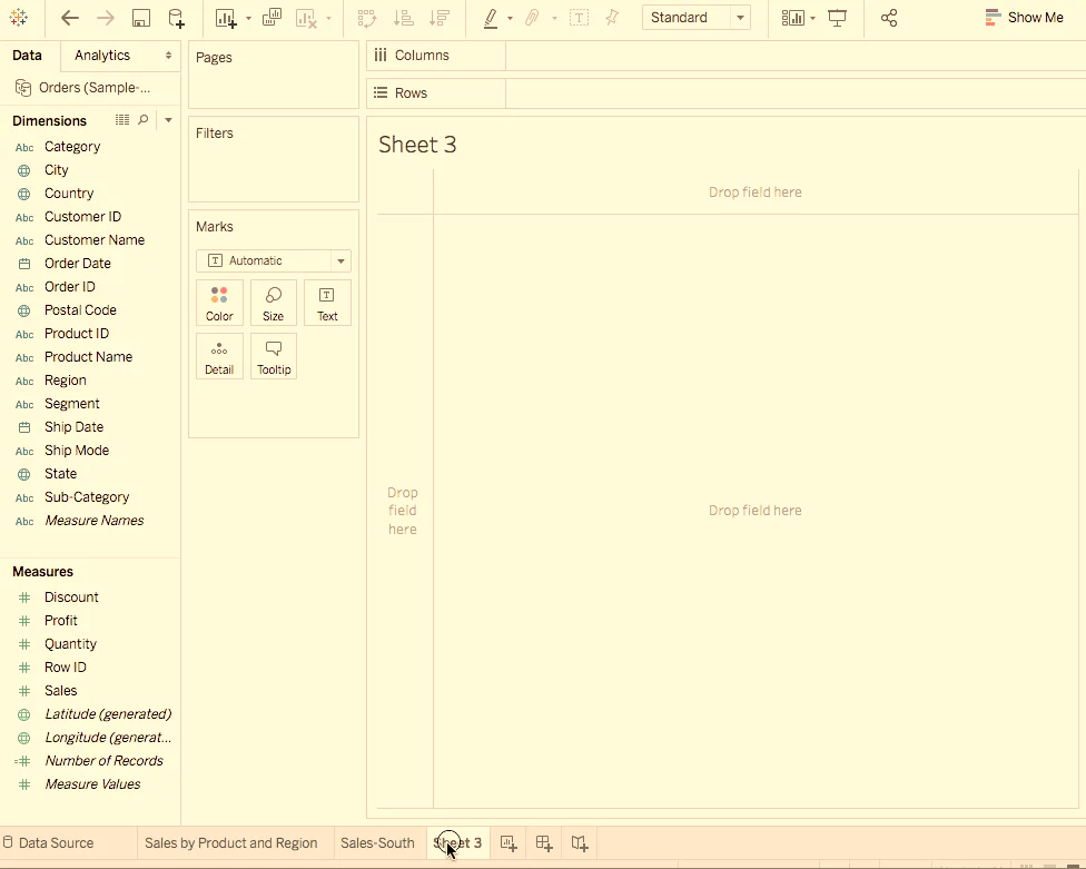
- Let us now give a name to the sheet. At the bottom-left of the workspace, double-click Sheet 1. Then type Sales by Product and Region.
- In order to preserve the view, Tableau allows us to duplicate our worksheet. So, we can continue in another sheet from where we left off.
- In your workbook, right-click the Sales by Product, Region sheet and select Duplicate. Then rename the duplicated sheet to Sales-South.
- In the new worksheet, from Dimensions, drag Region to the Filters shell. This is to add it as a filter in the view.
- In the Filter Region dialogue box, clear all check boxes except South. Then click OK. Now we can focus on sales and profit in the South. We find that machine sales had a negative profit in 2014 and again in 2016.
- Lastly, do not forget to save the results by selecting File -> Save As. Let us name our workbook as Regional Sales and Profits.
Hands On
Map View
Creating a Map View
Map views are beneficial when we are looking at geographic data. The best example for the tableau is geographical recognition. It will recognize the geographical information for the following.
- Country.
- State.
- City.
- Postal Code.
Steps
- Create a new worksheet.
- Add State and Country under Data pane to Detail on the Marks card. We obtain the map view.
- Drag Region to the Filters shelf, and then filter down to South only. The map view now zooms in to the South region only. Then mark represents each state.
- Drag the Sales measure to the Color tab on the Marks card. We obtain a filled map with the colors showing the range of sales in each state.
- We can change the color scheme by clicking Color on the Marks card. Then select the Edit Colors. We can experiment with the available palettes.
- We observe that Florida is performing the best regarding Sales. If we Hover over Florida, it shows a total of 89,474 USD in sales. This is compared to South Carolina. For example: which has only 8,482 USD in sales. Let us gauge the performance by Profit now. Since, Profit is a better indicator than Sales alone.
- Drag Profit to Color on the Marks card. We see that Tennessee, North Carolina, & Florida have negative profit. Even though it appeared they were doing good in Sales. Rename the sheet as Profit Map.
Hands On
Getting into the details
Maps empower us to visualize the data broadly. In the last step, we discovered Tennessee, North Carolina & Florida have negative profit. In this section let us draw a Bar chart. This is to explore the reason for the negative profit.
Steps
- Duplicate the Profit Map worksheet and name its Negative Profit Bar Chart.
- Click Show Me on the Negative Profit Bar Chart worksheet. Show Me presents the number of ways in which we can plot a graph. This graph will plot between items mentioned in the worksheet. From Show Me select the horizontal bar option. The view updates to horizontal from vertical bars instantly.
- We can select more than one bar at a time. This is possible by simply clicking and dragging the cursor over them. We want to focus only on the three states. i.e., Tennessee, North Carolina, and Florida. Hence, we will only select the bars pertaining to them.
Learn More
Creating Hierarchies
Hierarchies come in handy when we want to group similar fields. We can quickly drill down between levels in the viz.
- In the Data pane, drag a field. Then drop it directly on top of another field. This can also achieve by right-click the field and select.
- Drag any additional fields into the hierarchy. Fields can also be re-ordered in the hierarchy. This is by simply dragging them to a new position. In the current viz. we will create the following hierarchies: Location, Order, and Product.
- On the Rows Shelf, click the plus-shaped icon on the State Field. This will drill-down to the City level.
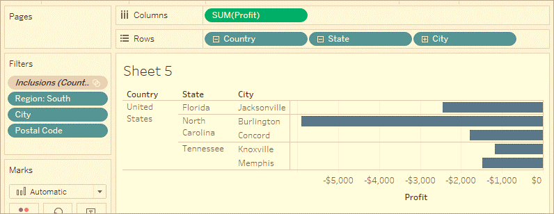
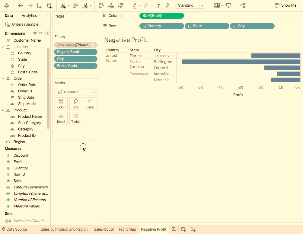
- That’s a lot of data. We can use N-Filter to filter and reveal the weakest performers. For that, drag City from the Data pane to the Filters shelf. Click By field. Then Click the Top drop-down and select Bottom to reveal the weakest performers. Type 5 in the text box to show the bottom 5 performers in the data set.
We now see the poorest performing cities by profit. They are,
- Jacksonville.
- Miami.
- Florida.
- Burlington.
- North Carolina.
- Knoxville.
- Memphis.
- Tennessee.
There is one other mark in the view. Jacksonville, North Carolina that doesn’t belong here. Since, it has profitable sales. This means there is an issue in the filter we applied. We will take the help of Tableau Order of Operations.
- On the Filters shelf, right-click the Inclusions set and select Add to Context. We find that now Concord appears in view while Miami have disappeared. This makes sense now.
- But Jacksonville (North Carolina) is still present which is incorrect. On the Rows shelf, click the plus-shaped icon on City tab. This is to drill down to the Postal Code level. Right-click the postal code for Jacksonville, NC, 28540. Then select Exclude to exclude Jacksonville manually.
- Drag Postal Code of the Rows shelf. This is the final view.
Hands On
Key Findings
Let us now focus only on the loss-making entities. i.e., Products & also we can identify the locations where we sold such products.
Steps
- Drag Sub-Category to the Rows to further drill down.
- Similarly, drag the Profit to Color on the Marks card. This enables us to spot products with negative profit quickly.
- Right-click the Order Date and select Show Filter. It seems that Machines, tables, and binders are performing poorly. So, what should we do? One solution would be to stop the sale of these products. These will be in Jacksonville, Concord, Burlington, Knoxville, and Memphis? Let’s verify if our decision is right.
- Let us head back o previously created Profit Map sheet tab.
- Now, click on the Sub-Category field to select the Show Filter option.
- Drag Profit from under Measures onto the Label Marks card.
- Again, click on the Order Date and select Show Filter. From the filter let us clear off the items. Which we think are contributing to negative profit. So, uncheck the boxes in front of Binders, Machines, and Tables respectively. Now we have only the profit-making entities. This shows that the entities like Binders, machines & tables. These shows were causing losses in some areas.
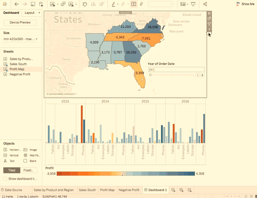
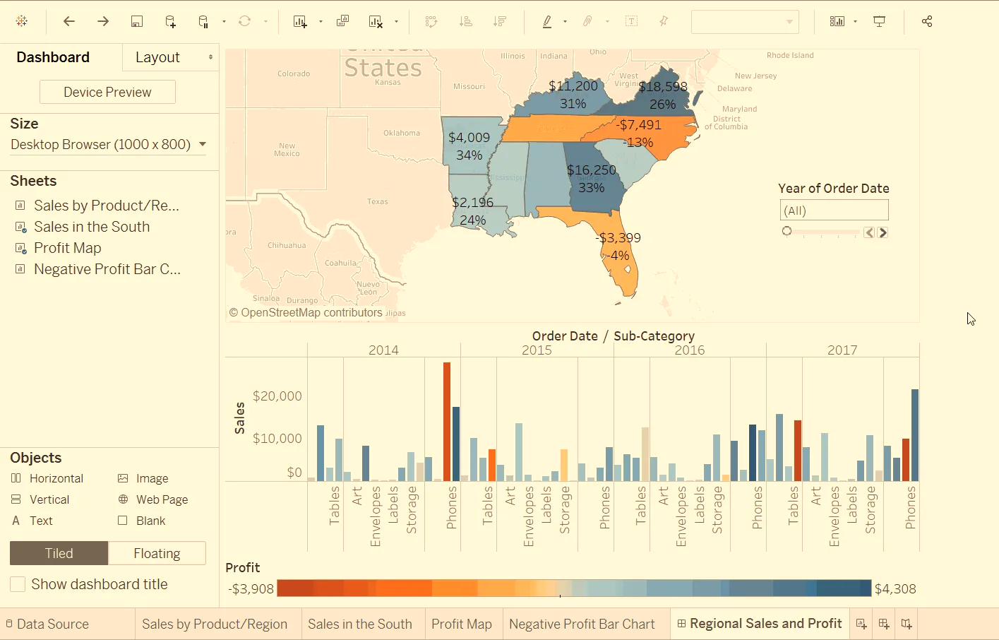
Dashboard
A dashboard is a collection of several views. It enables one to compare a variety of data.
Creating a Dashboard
Steps
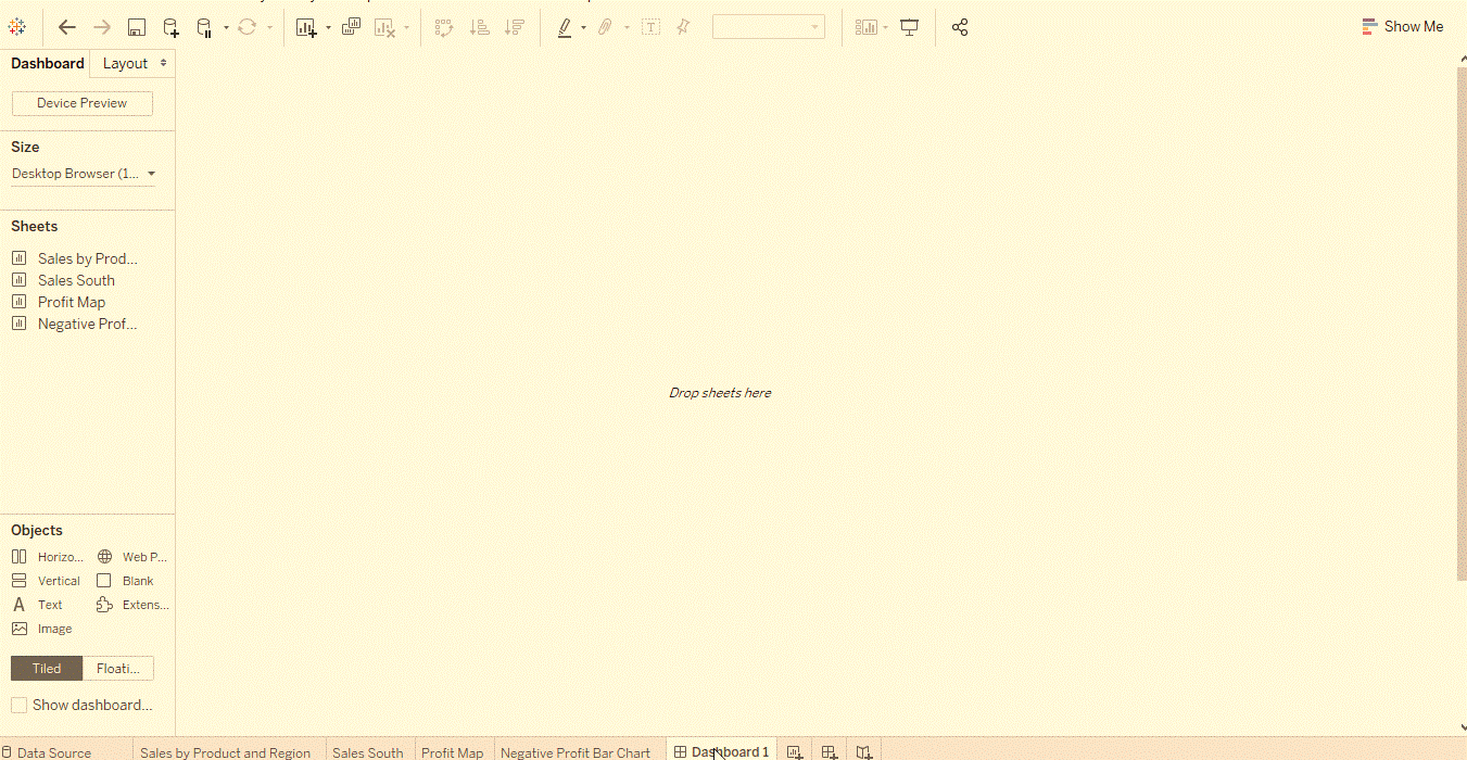
- Click the New dashboard button.
- Drag Sales in the South to the empty dashboard
- Drag Profit Map to the dashboard and drop it on top of the Sales in the South view. We can see both views at once. We can present data in a manner so others can understand it. We can arrange the dashboard to our liking.
- On the Sales South worksheet in the dashboard view. Click under the Region and clear off the Show Header. Repeat the same process for all the other headers. This helps to emphasize only what needed. It will also hide away the not so important information.
- On the Profit Map, Hide the Title. Then perform the same steps for the Sales South map.
- We can see that the Sub-Category filter card and Year of Order Date. This should repeat on the right-side. Let us get rid of the extra by simply crossing them out. Finally, click on the Year of Order Date. A drop-down arrow appears and select the option of Single Value (Slider). Now let the magic unfold. Experiment by choosing different years on the slider. The Sales will also vary accordingly.
- Drag the SUM filter to the bottom of the dashboard. This will be below Sales in South for a better view.
Hands On

Adding Inter-activeness
Making dashboard more interactive like viewing which sub-categories are profitable. This is in which states; we need to do a few changes.
Steps
- Let’s start with the Profit Map. On clicking the map, a Use as filter icon appears in the upper right. Click on it. If we select any map, Sales corresponding to that state. This will highlight in the Sales-South map.
- For the Year of Order Date, click on the drop-down option. Then go to Apply to Worksheets -> Selected Worksheets. A dialog box opens. Select the All option followed by OK. What does this option do? It applies filters to all the worksheets having the same data source.
- Explore and experiment. In the visualization below, we can filter the Sales South map. This is to view the sold products in North Carolina only. We can then easily explore the profits yearly.
- Rename the Dashboard to Regional Sales and Profit.
Hands On
Story
A dashboard is a cool feature. But tableau also offers us to showcase our results in presentation mode. This is in the form of stories about which we will discuss in this section.
Building a Story
Steps
- Click the New story button.
- From the Story pane on the left, drag the Sales in the South worksheet onto the view.
- Edit the text in the gray box above the worksheet. This is the caption. Name it as Sales and profit by year.
- Stories are quite specific. Here we will tell a story about selling machines in North Carolina. In the Story pane, click on Duplicate to duplicate the first caption. We can even create a new one.
- In the Sub-Category, filter select only Machines. This helps to gauge sales and profit of machines by year.
- Rename the caption to Machine sales and profit by year.
Hands On
Making a Conclusion
Machines in North Carolina are leading to loss of profit. We can demonstrate by looking at Profit and Sales overall. For this, we need regional Profit.
Steps
- In the Story pane, select Blank. Drag the already created dashboard Regional Sales & Profit onto the canvas.
- Caption it as Low performing items in the South.
- Select Duplicate to create another story point. This will be with the Regional Profit dashboard. Select North Carolina on the bar chart. This is because of the interest we have in showing more about it.
- Select All the years.
- Add a caption for clarity, like, Profit in NC: 2013-2016.
- Select any year like 2014. Add a caption. For example: Profit in NC: 2014 and then click on the Duplicate tab. Repeat the same step for all the remaining years.
- Click on the presentation mode and let the story unfold.
Hands On
Now we have an idea about, what are the products introduced to the North Carolina market. When, and how they performed. Not only we have identified a way to address negative profit. But have also successfully managed to back it with data. This is the advantage of Story in Tableau.